
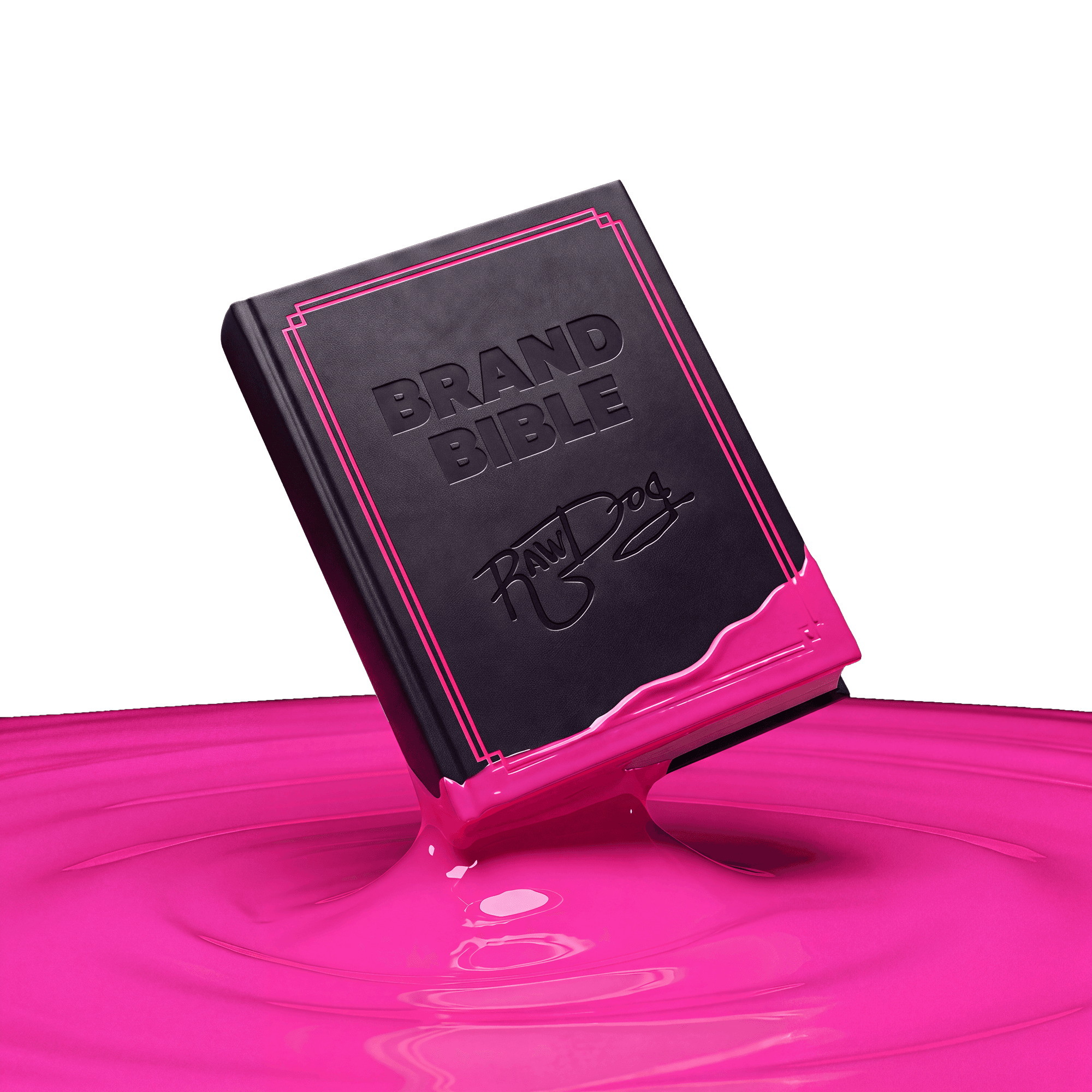
Creator Quick Guide
Read top to bottom: understand the brand, find the words, make it look right, then check before you post.
01
Brand Foundation
Positioning: premium protection for people who refuse to make intimacy boring. Promise: confidence, comfort, and a genuinely good time—without the awkward wellness lecture. Personality: bold, cheeky, warm, direct, body-positive, culturally awake, and never cruel.
Mission
Make protection something people actually want to reach for.
Audience
Confident adults who refuse to make intimacy boring.
Promise
A genuinely good time, without the awkward lecture.
Bold
Cheeky
Warm
Inclusive
02
Sound & Tone
Confident, not clinical. Funny, not try-hard. Sexy, not sleazy. Direct, not graphic. Inclusive, not performative. Bold, cheeky, warm, body-positive, and culturally awake—never cruel, shame-based, macho, or fear-driven.
Playful
Serious
Cheeky
Crude
Warm
Clinical
WE SAY
“Feels like Raw.” · “Keep it fun.” · “Built for chemistry.”
WE DON’T
Shame, fear, macho posturing, or jokes about consent.
03
Copywriting & Approved Lines
Use short sentences, active verbs, one clear message, and one strong joke. Lead with the feeling, name one proof point, then finish with one direct action. Keep jokes separate from health or performance claims. Approved starting lines include “Ready for a good time?”, “Feels like Raw™.”, “Keep it safe. Keep it fun.”, “Built for chemistry.”, and “Good decisions can still have bad ideas.”
Our premium latex condoms offer superior protection.
Feels like Raw. Covered like a pro.
Buy now for a limited time only!!!
Good decisions. Bad ideas. Grab a pack.
Hook
→ Payoff
→ One CTA
APPROVED LINES
Feels like Raw.
USE FOR: PACKAGING · ADS
Keep it safe. Keep it fun.
USE FOR: SOCIAL
Built for chemistry.
USE FOR: SOCIAL · ADS
Good decisions. Bad ideas.
USE FOR: SOCIAL
✗ Off-limits: health or performance guarantees, shame-based angles, and anything that puts consent in the punchline.
04
Fonts
Four roles, three families. Headlines lead with Atelia, subheadings and body run on Neue Haas Grotesk, and Filmotype Lucky adds decorative personality.
H1 — ATELIA
FEELS LIKE RAW.
H2–H5 — NEUE HAAS GROTESK BOLD
Bold subheadings carry the structure.
BODY — NEUE HAAS GROTESK REGULAR
Regular Neue Haas keeps body copy, captions, and supporting information clean and easy to read across every layout.
DECORATIVE — FILMOTYPE LUCKY
Ready for a good time?
05
Colors
Raw Pink is the attention color for key ideas and decisive moments. Raw Black is the primary stage and background. Raw White is the high-contrast text color. Keep the system dominant and restrained—do not dilute it with extra accent colors.
Raw Black
#0C1014
Secondary Black
#171C1F
Raw White
#FFFFFF
Raw Pink
#FC009C
Yellow
#FFEA2E
Turqoise
#02FFFF
06
Imagery & Prompts
Build saturated pink worlds with tactile materials, punchy flash or cinematic contrast, playful scale, and one obvious focal point. Product must feel physically present and packaging must stay accurate. Adults should look confident, expressive, inclusive, and real. Avoid generic wellness stock, sterile medical styling, childish cues, explicit nudity, and ambiguous consent.
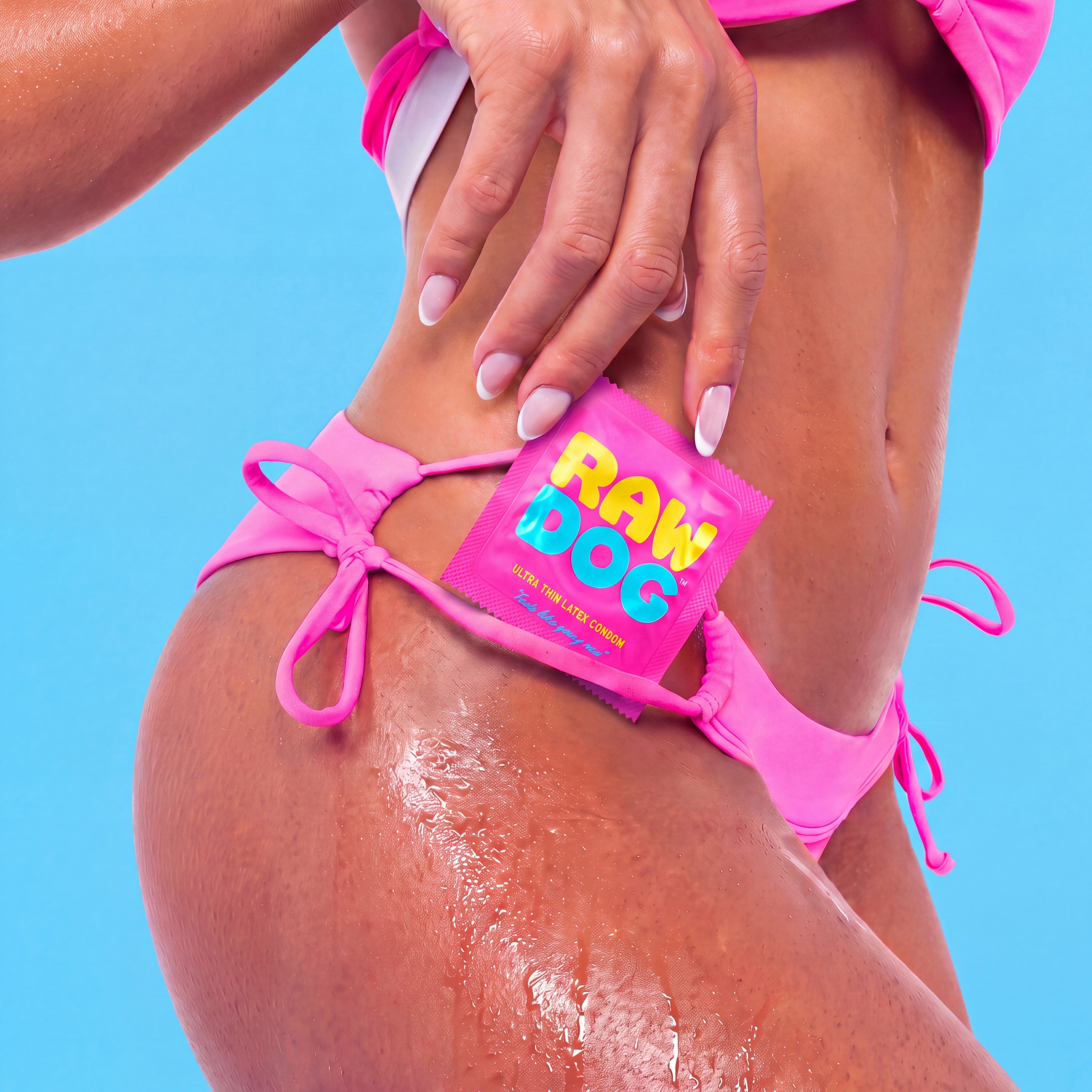


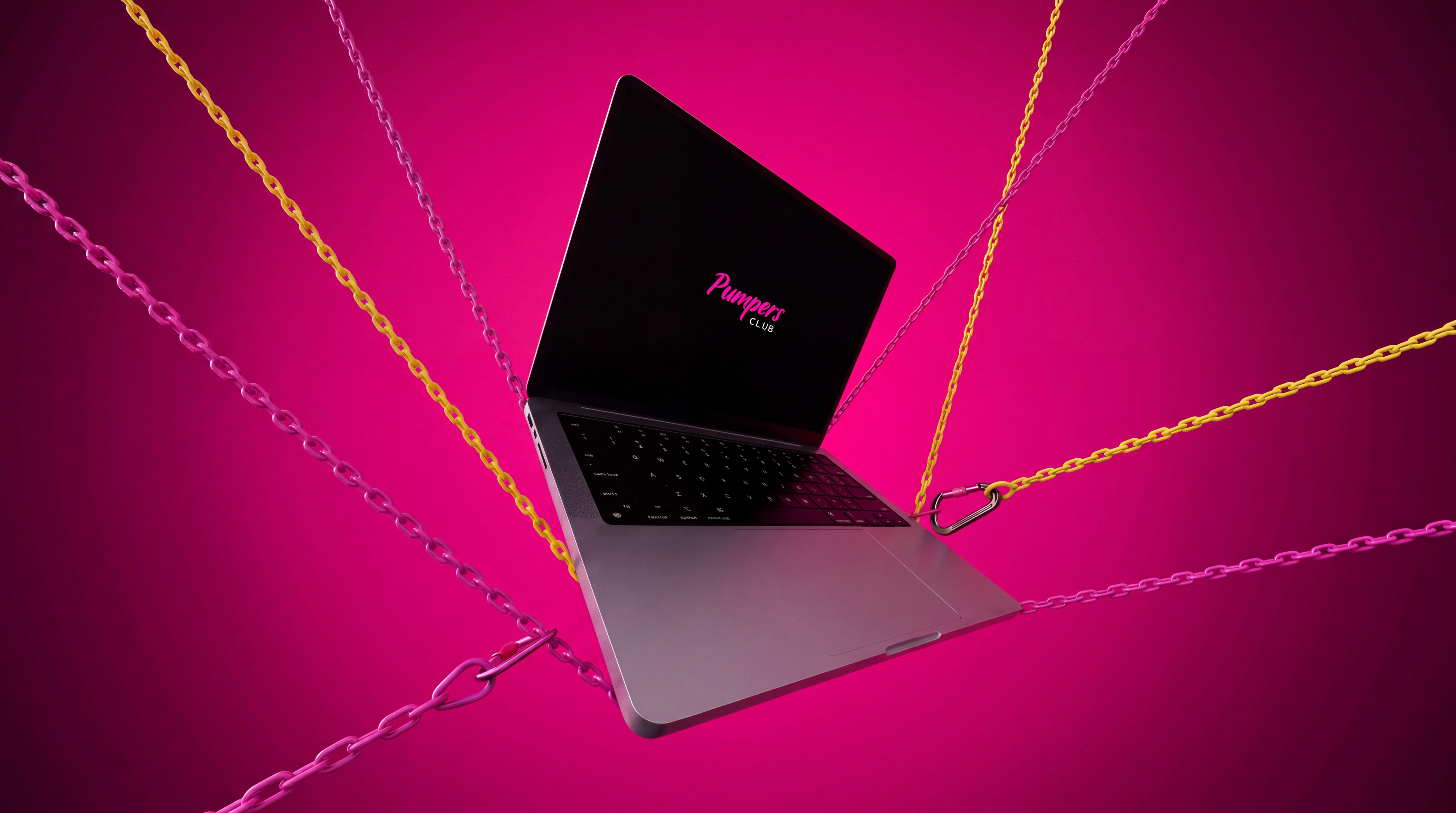
IMAGE PROMPT FORMULA
Subject
+ Playful setting
+ Pink palette
+ Punchy lighting
+ Premium finish
Pink RawDog packaging on glossy melting ice cream, flash-lit, deep black background, campaign-ready.
RawDog box staged on a soft peach surface, tactile texture, playful still-life, saturated pink accents.
✕ medical blue
✕ minors
✕ warped packaging
✕ generic stock
O7
Logos
The RawDog™ wordmark is the most recognizable part of the brand. Use only the approved files below, keep the proportions locked, give it room to breathe, and never redraw, stretch, recolor, or add effects to it.
PRIMARY · WHITE ON BLACK
[ Drop white wordmark SVG here ]
Default for dark backgrounds and product photography.
PINK WORDMARK
[ Drop pink wordmark SVG here ]
For black or white backgrounds when pink accent is needed.
BLACK ON WHITE
[ Drop black wordmark SVG here ]
For light backgrounds, print, and partner decks.
ICON / SOCIAL MARK
[ Drop icon / avatar mark here ]
Profile pictures, favicons, stickers, and small placements.
DO
Clear space: at least the height of the “R” on all sides. Minimum width: [ XX px ] digital / [ XX mm ] print. Always use the ™ where space allows.
DON’T
Stretch, rotate, outline, or add shadows and gradients. Recolor outside the palette. Place on busy photos without contrast. Pair with other logos without a divider.
Logo pack (SVG · PNG · EPS)
[ ADD DOWNLOAD LINK ]
08
Before it Goes Live
Check that it is clearly for adults, consent-positive, free from shame and stereotypes, accurate in product naming and packaging, limited to approved claims, cleared for talent and music rights, readable with captions, focused on one message, and still funny when read twice. Escalate health claims, partnerships, giveaways, customer stories, controversy, crisis replies, packaging edits, or anything that could be read as targeting minors.
